Week 01
The Creative Thought Process

Assigning Groups
Our Chosen Group
Since I chose a VR game i decided to look for peers in my class that had chose the same and had the same aspirations. I gathered 5 other people:
Aaron Lynch
Joe Burnett
Turlough Doherty
Filip Taranek
Jorden McCrellis
We also wanted to do different roles henceforth why we all make a good team due to our different strengths. The roles are as follows:
Game Design - Turlough
Level Design - Me
Interface Design - Jorden
Asset Development - Aaron and Filip
Visual Effects - Joe
Each of us chose these roles and also agreed to help each other out if a specific area starts to fall behind or needs extra help as we all share the same general knowledge in all each sectors. The team also voted me as the Team Leader to motivate everyone to keep on schedule and to follow through with all tasks to meet the final deadline.
Idea Generation
Brainstorming with Miro
We had a group discussion for a few hours and decided to brainstorm all of our collective ideas in Miro. Since I am the team leader, I typed out and made the Miro brainstorming map while the others discussed ideas. We also had input from our lecturer as our first idea was too similar to a very popular series and there was already a game made based on the Attack on Titans series. However from this idea, following advice, we took the grappling mechanic idea and have constructed our own unique idea with it. This below is the mind map we came up with in our first week.


Week 02
Design Phase
Concept Art
After a group meeting we decided I should get started on drawing some concepts for weapons, enemies, buildings etc for the game. These images gave the asset development team a more descriptive and visual representation of what they are creating in Maya to import into Unreal.
 |  |  |
|---|---|---|
 |  |  |
Presentation Feedback and Unreal Engine
Feedback and the Start of the Development Process
Mid-week we had to put together a short presentation on the basics of our game idea and explain where our team was going with the idea and how we are going to expand on it to make it become a real thing. The presentation went well and we picked up a lot of feedback which made us get into more detail with movement and the grapple gun in this game.
I also heavily studied a tutorial in how to setup an Oculus Quest 2 to my phone and to Unreal Engine. We decided we are going to use Unreal 4.25 as there was issues with 4.26 and setting up the VR. So to end the week I finally setup my workspace in Unreal with my VR headset connected ready for the team to start the development process.
Week 03


.png)
More Designing and Research
Sketches Updated and Reference
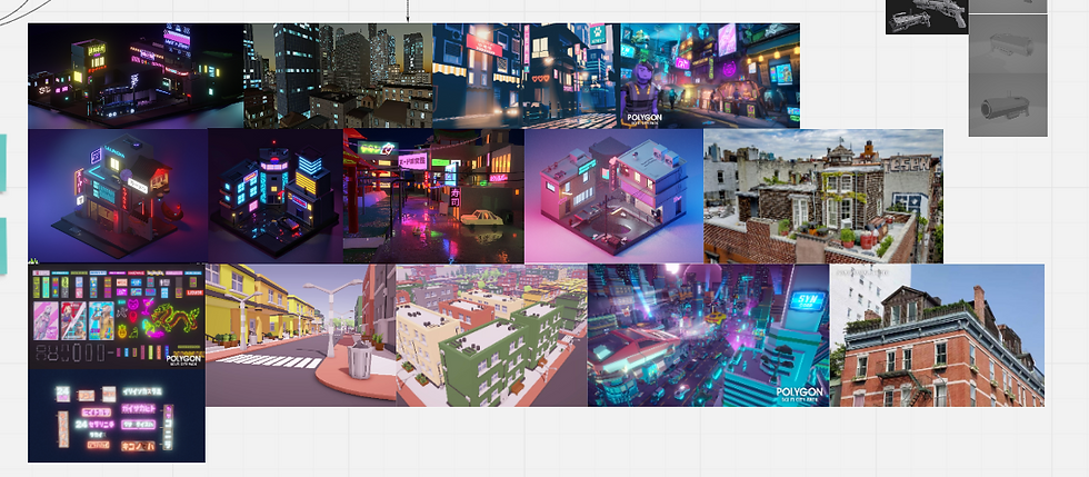
To start this week after feedback I went over my old sketches and decided to annotate all the important details to make it easier for the 3D artists to understand the exact proportions and details of textures. As a group we revisited the art style of the game as we hadn't it fully figured out yet. We agreed it was to be low poly and we gathered research on similar scenes that we would want our game to look like. We decided our inspiration for our art style was the games: .............................................
Miro
Board Updates
Upon collecting and reworking all the drawings I decided to update the Miro board as much as I could and this is the updated product. I added in various different bubbles as well as most of my reference images. We got these reference images to relate to our art style of the game. We also started to plan out a rough version of who is doing what models in Maya for Aaron, Fillip and Joe.


Colour Palette
Coolors.io
I created a colour palette to help our team visual the game more and to benefit our Maya modelling team with texturing and keeping the HEX codes consistent. The left 3 dark blacks and greys are going to be the colours of weapons and buildings. The environment is set at night so these colours will also be pretty dark to highlight the neon futuristic theme.
The pale yellow after the dark colours is to highlight the colour that will be in some windows in buildings to give the environment more of a night life instead of a dull city.
The next 3 colours of purple, blue and pink are going to be the colours of all the neon signs. I did research into the lighting in VR games and a lot of it must be natural, however, for us to dull the rest of the world down other than these signs and the smallest accents on the guns it wont make the player as strained or dizzy.
The last 3 colours are the colours of our 3 main weapons. These are only small accents amongst the black/grey main body of the gun itself. Therefore these small yet bright accents will add a lot to the guns and make them appear more futuristic and sci-fi. I also researched that the primary colours aren't to distract the player as much as the neon lights when clashing.

Week 04
Level Design
Birds Eye View
This is the first sketch of what we agreed the level would look like. The black lines are the potential paths the player can take. We wanted the player have options of where to go but also direct them using various different techniques through the levels. Around these potential player paths we are going to fill with clutter and buildings for the player to grapple to. The wall surrounding will also be modelled and placed surrounding the entire level. The purple dots are to symbolise potential locations for us to hide our 5 NPC aliens as a bonus mission/Easter egg for the player.

Week 05
Miro
Since the project is still being worked on and developed with the main mechanics I have decided to update the Miro board to keep up our organisation as we are running behind schedule with the mechanics. As I discussed with the team we thought it was best I have a full week to start level design when the main mechanics have been implemented. So with updating the new board you can see ive added in level design, progress on the project, bug fixes, and finally some images of models.


Week 06
 |  |  |
|---|---|---|
 |  | |
 |  |
UI Design
In 2 weeks we will be presenting to UI/UX designers from Incendiary Blue. Therefore we agreed as a group to start working on the main menus for the game as well as spatial UI. This is a font I designed using procreate on my iPad. This will be used for the main title, main menu, death and win screens and finally enemy and ammo counters.
 |  |  |
|---|---|---|
 |  |
UI Design
These are buttons I design in procreate for the main menu, pause menu, you died menu and you won menu. We decided to stick with the colour scheme to keep the game visually appealing and consistent throughout. We decided to stick with basic symbols that is well known to the general public so that it is basic knowledge to know what each button means when the player decides to push it. This button style was incorporated into the menus on the second draft as the first draft didn't work out in as it was too basic.
Week 07
 |  |  |
|---|---|---|
 |  |  |
 |  |
UI Design
After drawing out draft 1 and 2 this is the final draft for the UI menus with annotations too. Here you can also see the menu designed and programmed into the game before our presentation with my buttons and titles that were previously designed the week before.
 |  |  |
|---|---|---|
 |  |  |
UI Design
This is also a hologram background I designed and that was implemented into the game in order to present clear and spatial UI design for the enemy counter and ammo counter. This week I also made the PowerPoint presentation on Canva to showcase our ideas to Incendiary Blue which you can view here:
Week 08


Week 09
 |  |  |
|---|---|---|
 |  |
Level Design Second Draft
This is the second draft of the level. The team made more models this week which was wooden crates, bins, binbags. I imported these objects into the level to give the level some meaning and clutter and started to position and block out level 2. I also decided to import enemies into the level for playtesting purposes to help out the programming team.
Week 10
 |  |  |
|---|---|---|
 |
Level Design Third Draft
This is the third draft of the level. I decided to go for a completely different layout because it would benefit the player more if there were buildings on each side of the street to grapple to. There is now 3 variations of the small buildings and 2 variations of the medium sized buildings. I also added in a torii gate and pagoda to make the environment feel like its in Tokyo as that is what it was lacking in previous versions. Textures were also added which made it much more authentic and realistic.
Week 11
 |  |
|---|
Level Design Improvements
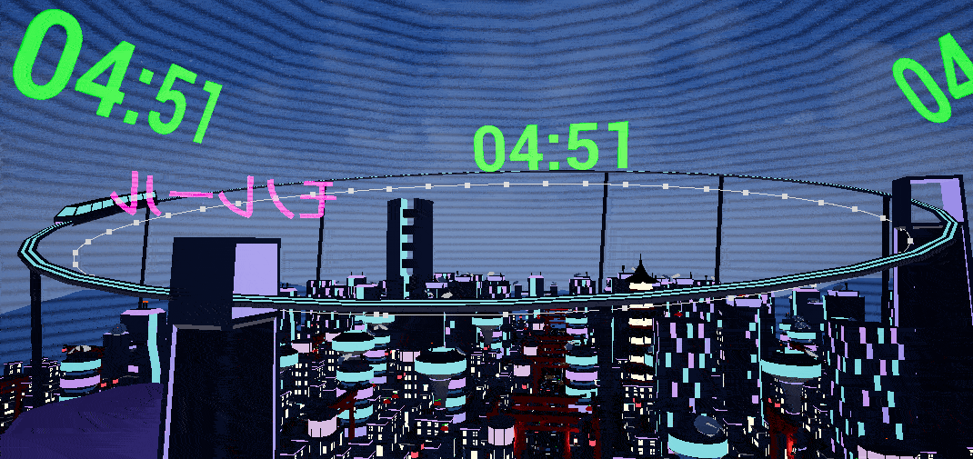
I placed small buildings throughout the open world as well as started to add more medium buildings and more of the larger buildings the deeper you travelled into the city. I added more lights and details as I felt I could achieve so much more with more models being completed. I also expanded heavily on the size and scaling of the level due to having my metric gym completed on the third draft once I restarted the level as the scale didn't work in the first two drafts. My next goal is to add more roads, natural paths for the player, train stations, neon signs etc. to make the environment become more alive
Week 12
More Level Design Improvements
This was the last week of university and we presented a detailed update on what stage our game is on. This week I added in 3 large landmarks throughout the map so that the player always has an idea of where they are in the map. I spaced out the buildings even more because they were too cramped and clustered for the player to swing through certain areas of the map. Also instead of there being one large road through the centre of the city I added in two extra roads going horizontally across the main one. Here I added in extra torii gates at each cross roads.
Christmas Holidays
 |  |  |
|---|---|---|
 |  |  |
 |
The Tutorial Level
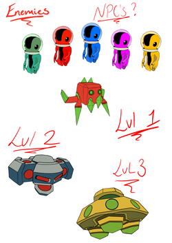
As a group we decided that the player wouldn't know how to use or understand the concept of the game without having a small tutorial like level at the beginning of the game. During playtesting we found that few people knew how to grapple but eventually learned after being in the game a while. Therefore I made a small starting area decorated with the traditional Japanese props made and also used signs explaining to the player the next steps of the game as well as how to play. In constructing this area I thought it would be best to show the player the two types of enemies they would be facing so they are ready for the challenge when the reach the main level as well as letting the player test out their own grappling skills using the grappling mechanic and others implemented into the game. In the tutorial the player cannot progress unless they have grasped the use of the grappling mechanic which we all agreed it would be the best method to get the best experience when playing the main level. To connect the main level to the tutorial level I used a tunnel with the main colour scheme introduced throughout it and the tutorial so the player would slowly be introduced to such heavy use of the neon colour throughout our game.
 |  |  |
|---|---|---|
 |  |  |
 |  |  |
 |  |  |
 |
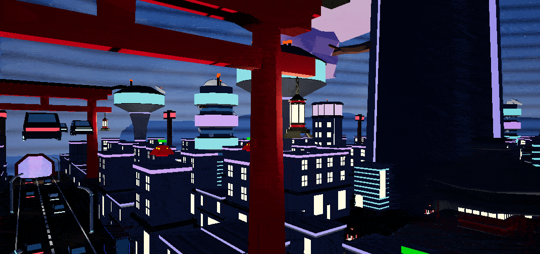
The Final Project
This is the final level design of the game. The holographic dome was added in around the level so the player couldn't easily escape or go out of bounds. Therefore I had to alter the edges of the entire level and reposition buildings to create a border inside of the dome. I also made the decision to connect the two horizontal roads with another small road as this gave the player more optional routes to take and made the environment look a bit more realistic in having more roads for the cars to travel down. The cars and train were then scripted into the level as well. To add in the last finishing touches I added in hanging lanterns off the torii gates to light up the road as we had to previously take out lampposts due to overlapping lighting. I also added in ground lanterns to resemble the traditional Japanese culture props. These lit up a lot more areas of the level that were in need of better lighting. Telephone mast were also added in to break up the height of majority smaller buildings and medium buildings as when grappling the surrounding area looked very flat.